Victoria Neeser
The Best One in Your Row
Let's make a small digital tool using an off-the-shelf design system.
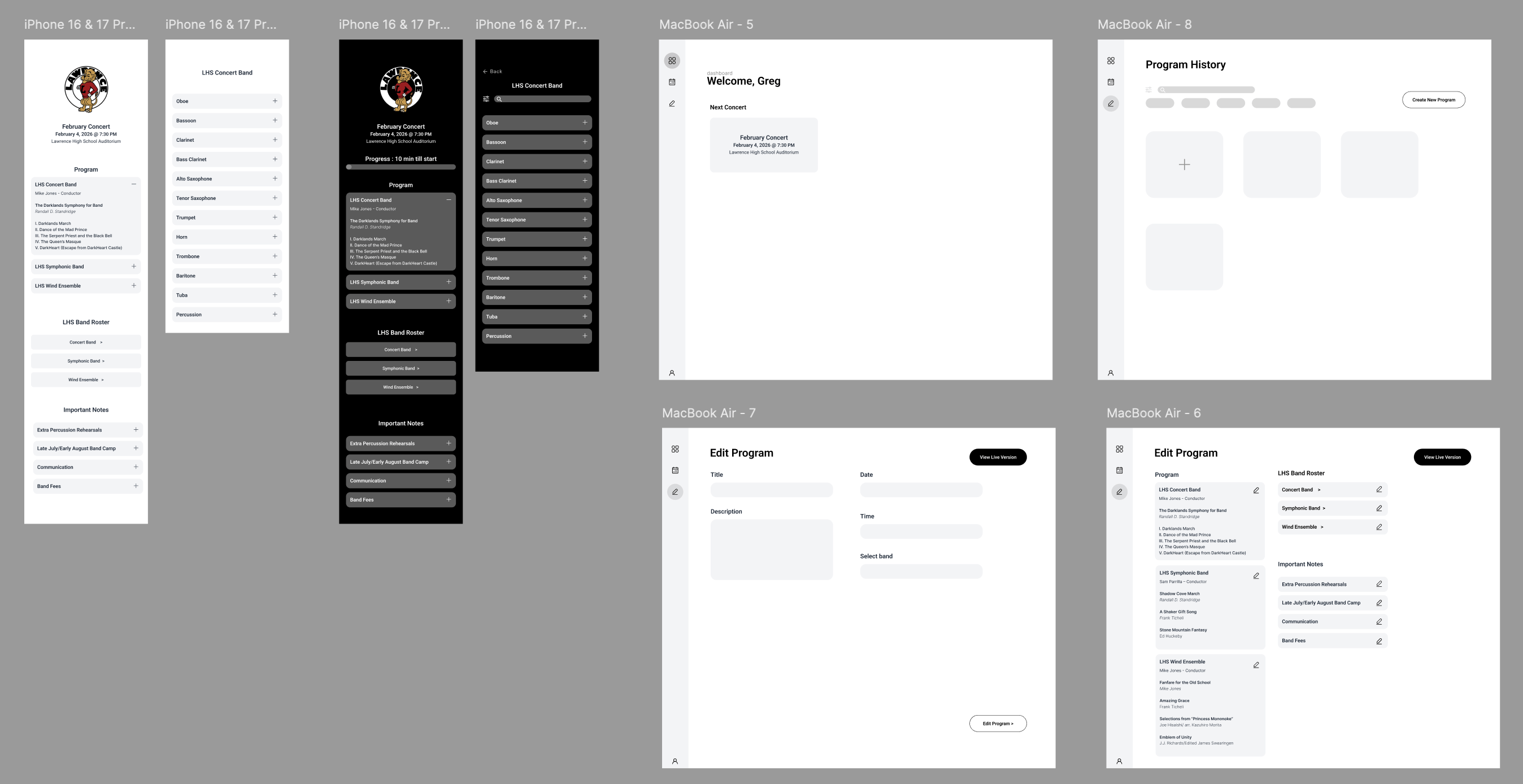
You will design a small web application to build and display simple concert programs. We'll have mobile-friendly view-only access for patrons, and a desktop experience for music directors.
Project Information
Your Client
Your client is a new band director at a high school who wants to launch a new tool to support his concerts - and share with others like him.My predecessor in the band department gave up printing paper programs for each band performance. Instead he posted a QR code that pointed to a PDF he made in MS Word. That means the parents and grandparents have to view a bright screen during our performances, and pinch and zoom and fumble with their phones just to read their kids names.
Project Information
Deliverables
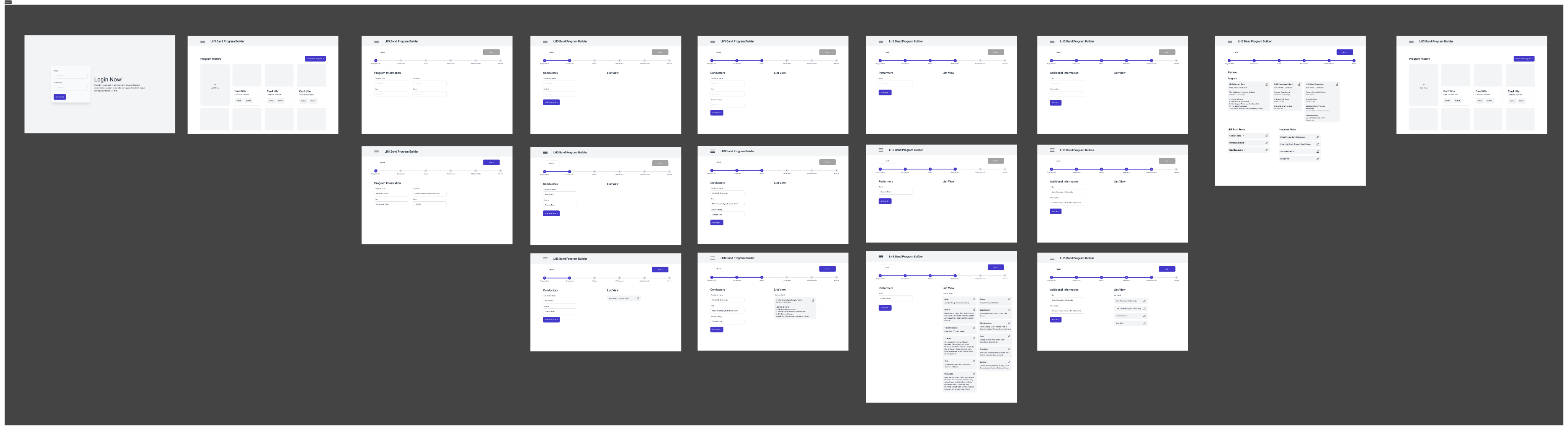
We'll go step-by-step through specific design deliverables that get us closer to an interactive system to solve our client's problem. Wireframe Prototypes, Using an off-the-shelf design system
Guerrilla User Testing, Customizing that off-the-shelf system
Prototypes, Guerrilla User Testing, Some other requirements:
We'll make one interface for the patrons designed for mobile screens. We'll make another interface for the directors designed for desktop.
Session 1:
Introduction & Ideation
Homework: Start wireframing out the user experiences. You can use gray boxes OR if you feel comfortable, jump right into plain DaisyUI components. Don't customize them yet.
Session 2:
Keeping going, using DaisyUI components
Homework: Prototype this out enough that we can be ready for some guerilla testing next week.
Session 3:
Review & Test
Homework: Guerrilla user testing. Test with 5 people. Document it. Write observations on what could/should change based on user testing.
When?
Tuesday after class
Where?
Sorority house
Who?
Sorority girls I did not know
What did you learn?
Overall Take Aways
Users preferred simplicity, clarity, and to know where they’re at in the system
Main issues:
Wanted to do more with the app
Readability concerns - Smaller text
Fix the “Add” button side panel
Gabby
Immediately began scrolling. Expected a simple, continuous view. Takeaway: App experience should be scroll-based with minimal interaction
Thalea
Primary vs secondary button was confusing. Takeaway: Need a clear primary button, suggested the bright blue/purple
Lauryn
Mobile version was easy to navigate. Takeaway: Wished you could do more on the app
Megan
Focused on readability, zoomed in and treated it as older ppl. Takeaway: The text feels kind of small, contrast, and accessibility
Ashley
Did not notice that selecting “Add” populated the side panel
Takeaway: Provide visual feedback and placeholders to indicate where items are added and the expected quantity
Session 3:
Going beyond the library & Final Deliverables
Homework: Style, brand, fix UX problems, whatever you want. Be ready for a final crit next class.